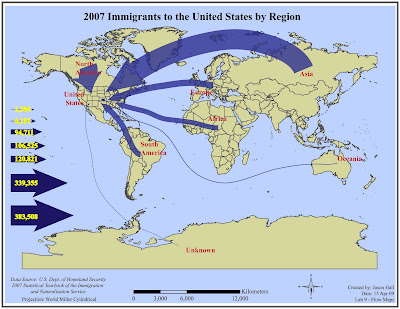
 I chose a 40pt line weight for the largest line and the World Miller Cylindrical projection. This map was interesting to see on the blog. Others broke up the regions and spaced them around the map and some chose to do like I did with the whole world in view. After looking on the internet, I saw someone just show the US with line coming in and no other regions shown. All seem to be right, I just prefer to show the overall view.
19 April 2009
Immigration Flow Map
 I chose a 40pt line weight for the largest line and the World Miller Cylindrical projection. This map was interesting to see on the blog. Others broke up the regions and spaced them around the map and some chose to do like I did with the whole world in view. After looking on the internet, I saw someone just show the US with line coming in and no other regions shown. All seem to be right, I just prefer to show the overall view.
Subscribe to:
Post Comments (Atom)


No comments:
Post a Comment